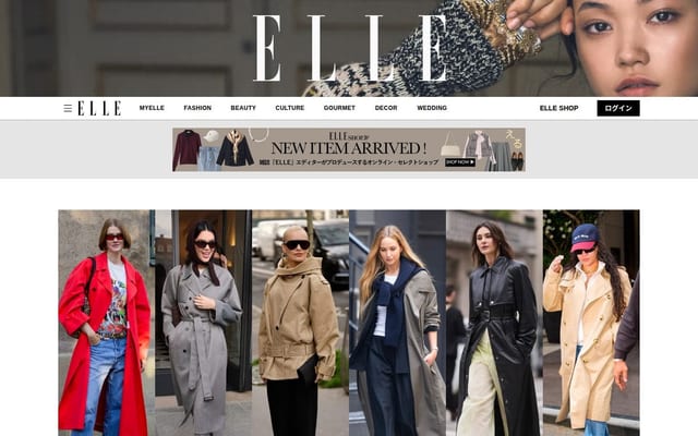
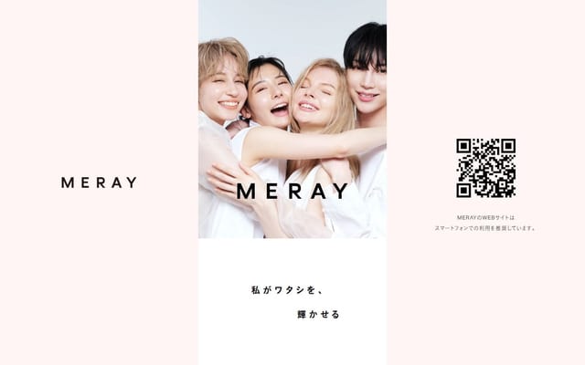
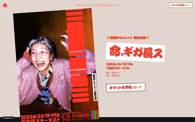
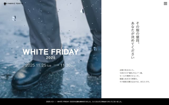
サイトを開く
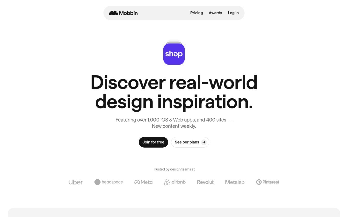
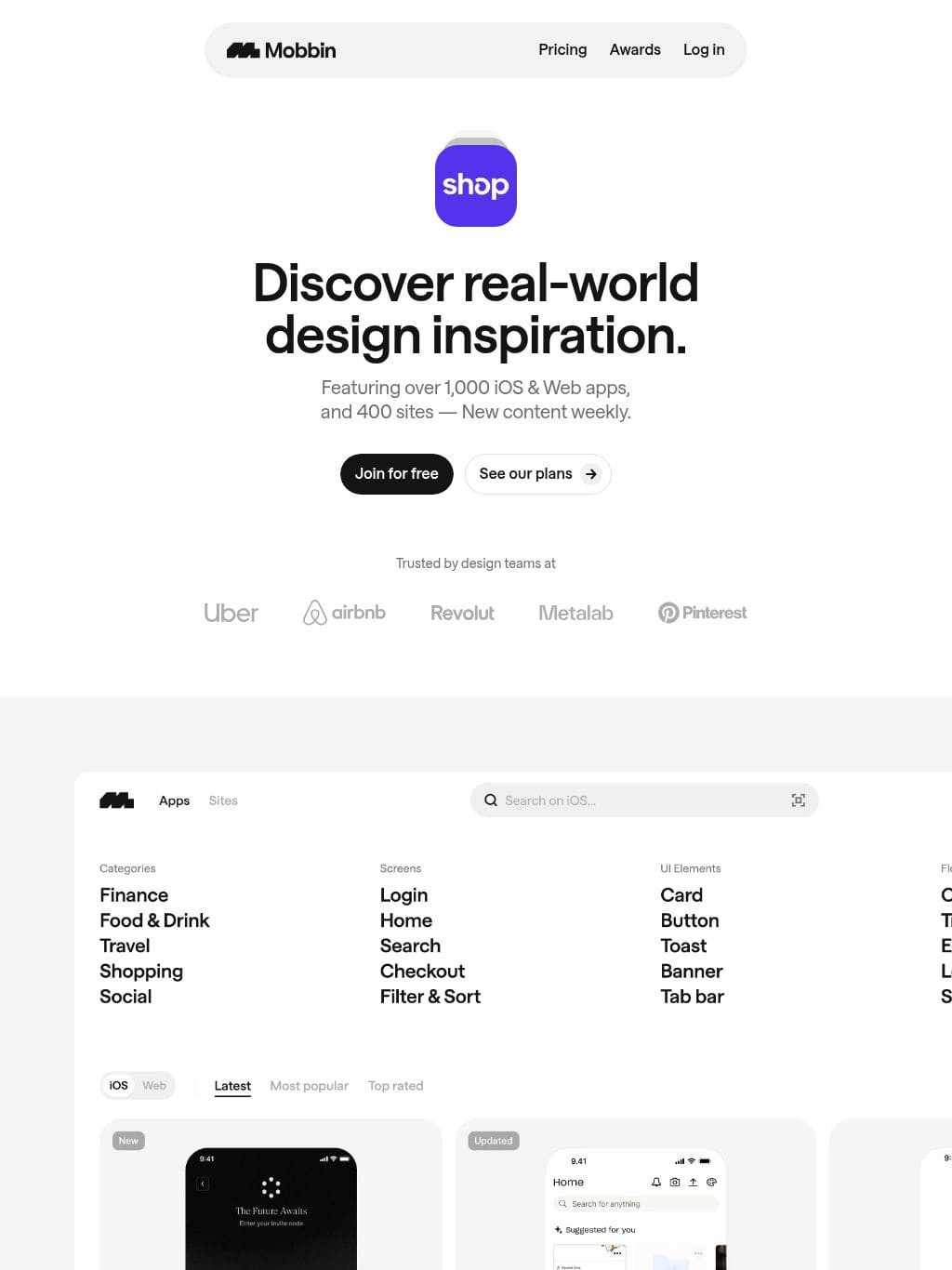
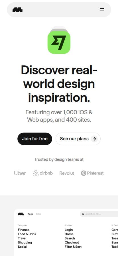
Save hours of UI & UX research with our library of 600,000+ fully searchable mobile & web app screenshots.
Pricing Awards Log in Discover real-world design inspiration. Featuring over 1,000 iOS & Web apps, and 400 sites — New content weekly. Join for free See our plans Trusted by design teams at A growing library of 1,704 apps 588,100 screens 135,100 flows Find design patterns in seconds. Screens UI Elements Flows Text in Screenshot Profile Wallet Welcome Account Setup Home Subscription & Paywall Login Settings Checkout Collections Profile Wallet Welcome Account Setup Home Subscription & Paywall Login Settings Checkout Collections Explore entire user journeys with flows. Videos Experience flows the way they were meant to be experienced, complete with transitions, micro-interactions, and animations. Prototype mode Walk through flows, step by step, by using the interactive hotspots at your own preferred pace. From inspiration to creation. Copy to Figma Download designs you like or copy it straight into Figma with our new Figma plugin. Save to collections Collect your favorite designs and upload your own screenshots into one place. Leave comments Take notes upon saving so you’ll never forget the context in the future. What our users are saying. Sebastian Speier Shop Mobbin is a great resource and it always comes in handy to see what the best practices or standards are for mobile patterns in our current landscape. Marco Cornacchia Figma Mobbin is one of my favorite resources for product design and ui inspo. I love having access to a ton of “real world examples” to see how different apps and companies handle specific UI patterns and flows. Haerin Song Visa By using the Mobbin app, I save both my research time and space in my photo galleries filled with random screenshots. I love how easy it is to search for different patterns and copy and paste flows into Figma. It is a wonderful design tool you cannot live without! Meng To DesignCode Mobbin is a game-changer for designers looking to step up their understanding of UX and UI design patterns. It’s soDesign Tokens(DOM解析データ)
このサイトを 1440×900 でレンダリングして、実際のCSS値から自動抽出した数値データです。「同じ感じ」を再現する材料になります。
カラーロール
Background
#ffffffText
#141414Color #1
#141414Color #2
#ffffffColor #3
#adadadColor #4
#707070Color #5
#ffffff0fタイポグラフィ
| 要素 | Font | Size | Weight | Line | Tracking |
|---|---|---|---|---|---|
| h1 | saans |
80px | 652 | 80px | -0.6px |
| h2 | saans |
44px | 652 | 48px | -0.4px |
| 本文 | saans |
20px | 440 | 26px | normal |
| リンク | saans |
16px | 400 | 24px | normal |
| ボタン | saans |
16px | 400 | 24px | normal |
使用フォント頻度
saans663箇所
スケール・形状
- 角丸スケール
- 9999px / 12px / 20% / 32px / 20px 20px 0px 0px / 8px / 30% / 12.22% / 5.65%
- シャドウ
- 4パターン使用
- セクション余白(pt/pb)
- 200-80px / 40-0px / 80-80px / 160-80px / 80-80px
- コンテナ幅
- width: 1440px / max-width: none
- ナビゲーション
- 高さ 0px / position: sticky