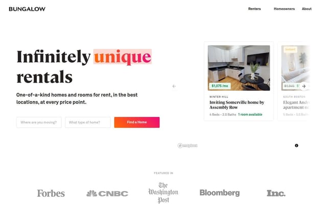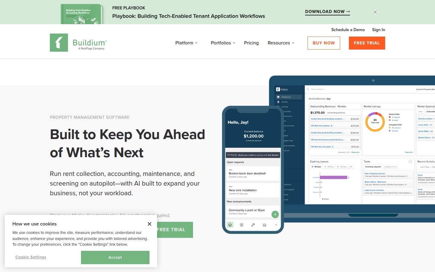
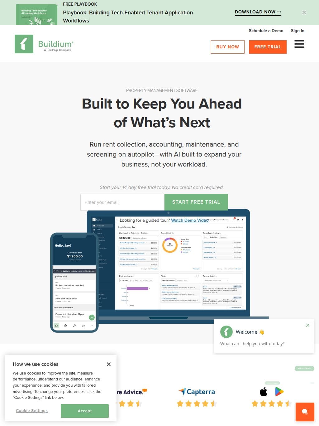
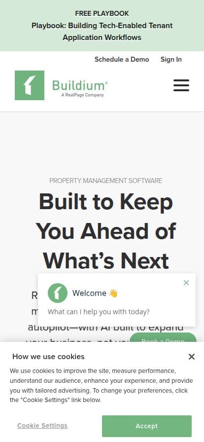
See how Buildium's property management software lets you control your day-to-day tasks, offer top app experiences, and uncover new revenue.
Buildium は米国 No.2 シェアを誇る不動産管理 SaaS(RealPage 傘下)で、AppFolio と並んで小〜中規模ポートフォリオ向けの定番ツール。LP の構成は典型的な B2B SaaS の教科書で、ヒーローセクションには製品ダッシュボードのスクリーンショットを斜め配置 + h1「Property management software made easy」+ Free Trial CTA。スクロールすると、ロール別(Property Manager / Owner / Resident / Vendor)の機能タブ、料金プラン3階段(Essential / Growth / Premium)、Trust Badge(10,000+ companies, 2M+ units)、顧客事例カード、自動化機能(家賃徴収・申込書類・修繕依頼)の動画デモが順に展開する。日本市場で iedoki さんが差別化するなら、「Easy」訴求の上位互換として「月額0円」USP を全面に出すことができる。Buildium が「機能で勝つ」とすれば iedoki さんは「コストで勝つ」が現状の構造優位。さらに日本市場特化(税務・宅建法対応・LINE連携)で機能でも追従可能。このデザインを再現するAIプロンプト
Cursor / Claude Code / v0 にこのまま貼り付けると、近いトーンのLPが生成できます。
中規模オーナー向け不動産管理 SaaS の LP を作って。
スタック: Next.js 14 (App Router) + Tailwind CSS + Framer Motion (微small)
フォント: Inter (見出し 700, 本文 400/500)
カラートークン:
--primary: #3da66a (Buildium Green)
--primary-dark: #2c8a55
--bg: #ffffff
--bg-alt: #f6f9f7 (sage tint)
--text: #0f1f15
--text-soft: #486357
--border: #e5ebe7
レイアウトグリッド: 12カラム、コンテナmax-width 1200px、左右余白 24px
セクション構成:
1. Sticky Nav (60px高、白bg + drop-shadow on scroll)
- logo / Features / Pricing / Resources / Login / Get Started (primary btn)
2. Hero (640px高、bg-alt)
- 左50%: Eyebrow tag「Property Management Software」+ h1「Easy property management for landlords and PMs」(56px Inter 700) + lead 18px + CTA2つ (primary + secondary outline)
- 右50%: 製品ダッシュボードの斜め配置スクリーンショット (rotate-3 transform), shadow-2xl
3. Trust Badges (60px高、グレー)
- 「10,000+ companies trust Buildium」+ 顧客ロゴ6社グレースケール
4. 機能セクション × 4 (各 480px高、bg白とbg-altを交互)
- レイアウトは交互(左テキスト/右UI ↔ 右テキスト/左UI)
- h2 + 3つのbullet + 製品UI screenshot
5. 料金プラン3階段
- 中央プラン (Growth) を強調(border-primary + 「Most Popular」バッジ)
- 各カードに価格・含む機能リスト・CTA
6. Customer Stories (3カード、ホバーで浮く)
7. FAQ (Accordion, 5問)
8. Footer CTA バナー (primary bg, 白文字, h2 + button)
9. Footer (4カラム、リンク群)
インタラクション: スクロール連動で各セクションフェードイン (framer-motion whileInView)、CTAホバーで shadow 強化、料金カードホバーで scale-105。
SEO: title「Property Management Software | YourBrand」、og:image はヒーロー、構造化データ Product + Organization 出力。
デザインの特徴
米国 No.2 シェアの不動産管理 SaaS。グリーン #3da66a の信頼感と Inter sans の整然としたフォントワーク、AppFolio との二強競争で「Easy to use」を訴求軸に置く。SMB(中小オーナー)特化のポジショニングが UI 全体に反映されている。
Design Tokens(DOM解析データ)
このサイトを 1440×900 でレンダリングして、実際のCSS値から自動抽出した数値データです。「同じ感じ」を再現する材料になります。
カラーロール
Text
#2f2f31Color #1
#2f2f31Color #2
#ffffffColor #3
#2c3e50Color #4
#2a7ab0Color #5
#727274タイポグラフィ
| 要素 | Font | Size | Weight | Line | Tracking |
|---|---|---|---|---|---|
| h1 | proxima-nova |
14px | 400 | 52px | 0.8px |
| h2 | proxima-nova |
48px | 700 | 60px | -0.47px |
| h3 | proxima-nova |
32px | 700 | 40px | -0.3px |
| 本文 | proxima-nova |
22px | 400 | 32px | normal |
| リンク | proxima-nova |
18px | 600 | 26px | normal |
| ボタン | proxima-nova |
14px | 600 | 17px | 1.15px |
使用フォント頻度
proxima-nova702箇所
Helvetica10箇所
Open Sans4箇所
スケール・形状
- 角丸スケール
- 8px / 4px / 12px / 50% / 5px / 0% / 2px / 3px
- シャドウ
- 5パターン使用
- コンテナ幅
- width: 1140px / max-width: 1140px
- ナビゲーション
- 高さ 26px / position: static